How Strategic Use of Paint Transformed the North Texas Women’s Basketball Space

In 2016, North Texas revamped its women’s basketball program with updates to the locker room and facilities. The Mean Green were looking for ways to inspire their players, make the team feel more comfortable at home and take the next step in recruiting — all while staying within their budget. Advent stepped in and used paint, dimensional text and effective brand statements to highlight the women’s basketball program’s strengths. Throughout the project, the Advent design team explored how elements like paint can maximize a budget, and how overlapping components from two projects can contribute to a cohesive brand identity.
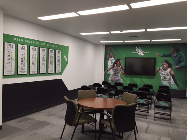
A paint mask gives the women’s basketball spaces elements of color and branding. To create a paint mask, designers take patterns from a client’s logo or elements from their brand guides and incorporate them into the paint structure. This typically puts the paint in the client’s scope by covering a large surface area on a smaller budget, while simultaneously making the space more unified.
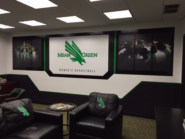
Cohesive brand representation across a space is paramount, but different sports and different teams have unique identities. For instance, women’s basketball programs sometimes don’t want their design to be as masculine as football. Designers can tweak subtle elements like angle cuts and graphic styles to soften or harden edges, staying on-brand while adjusting for individual program identities and preferences. For example, a men’s team may use a gritty texture, and a women’s team may receive a sleeker look with more gloss and less grit.
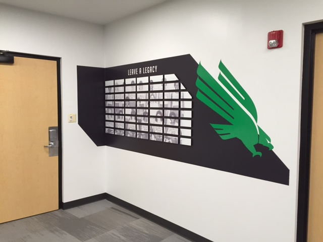
At North Texas, Advent used the same design language between the football and women’s basketball spaces, but adjusted to fit each program’s identity. The design team used angle cuts in both spaces, but but not as dramatically with women’s basketball as with the football program, for a result that isn’t too jagged or sharp. The paint pattern is loosely based on the wings of the eagle and the letter ‘M’ in North Texas’ brand mark.
Judicious design strategy and execution can make the most of paint on a budget — not just in covering large spaces, but in telling the right stories. When combined with the use of the right design elements in the right locations, the resulting space is one that boosts team pride and program visibility, allowing each program room to breathe within an overarching brand. Advent is continuing to work with North Texas on other projects and has also used paint as a primary element for projects like Tulane basketball and VCU basketball.