Bold Branding Takes over Penn Basketball’s Offices and Practice Gym

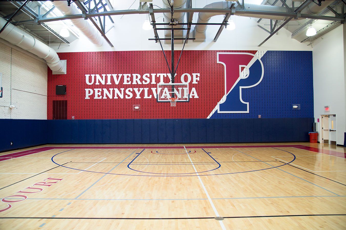
Penn basketball has been one of the Ivy League’s most storied programs and a key part of Philadelphia’s Big 5 tradition. In recent upgrades to the John R. Rockwell Gymnasium and TSE Center, Advent livened up a sterile and dated environment with bold color and branding. Advent’s Seth Maddox led the design on this project. Here, he discusses the challenge of cleaning up a cluttered space and adding branding throughout Penn’s practice gym, locker rooms, coaches’ offices and lounges while staying within budget. “Previously, only the court was branded, and they lacked branding or color on the walls. It was a very generic space. Any time you’re doing something in a practice gym, simple square footage drives what you’re capable of. With the number of areas we were working on, we had to be very cognizant of how we used the space.” “The main goal in the practice gym was to liven up the space with some color and show the history and the success of the program. You’re seeing large banners that show some of the numerology. We highlighted championships and All-Americans to serve as motivation for them while they’re practicing. It looks like a Penn space rather than a generic court. ”
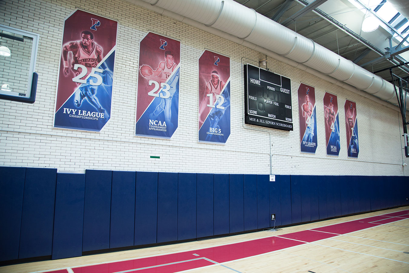
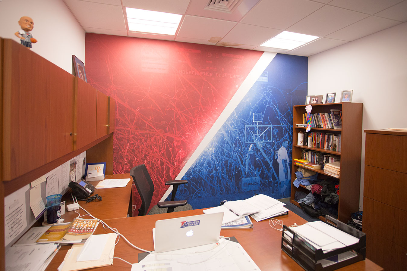
“There’s a big color shift from red to blue in most concepts. That comes from their primary mark, the ‘Split P’ logo. We took that as our main inspiration. Most of our wall graphics and wall coverings go from red to blue. They really like that a lot. It really resonated with them.”
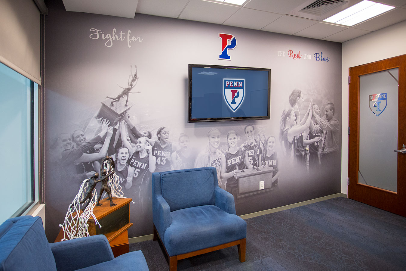
“One other design cue that was interesting was a handscript font that we don’t use that often. That ties back into the history of Pennsylvania and the framing of the Constitution. That was an interesting detail we used throughout. We used that design element in the window vinyl.”
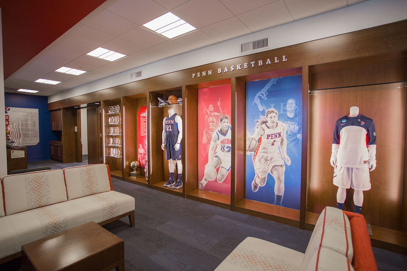
“We really wanted to liven up and brand a bookshelf area that spanned the whole office space. We proposed adding some graphics there, removing some of the shelving and keeping some of the existing casework and lighting because of budget. We livened that up with some mannequin displays, award winners and graphics.”
“We had one wall to work with in each office space. We tried to use imagery as well as color. We installed a full wallcovering on impact walls, featuring two images with the ‘Split P’ concept.”
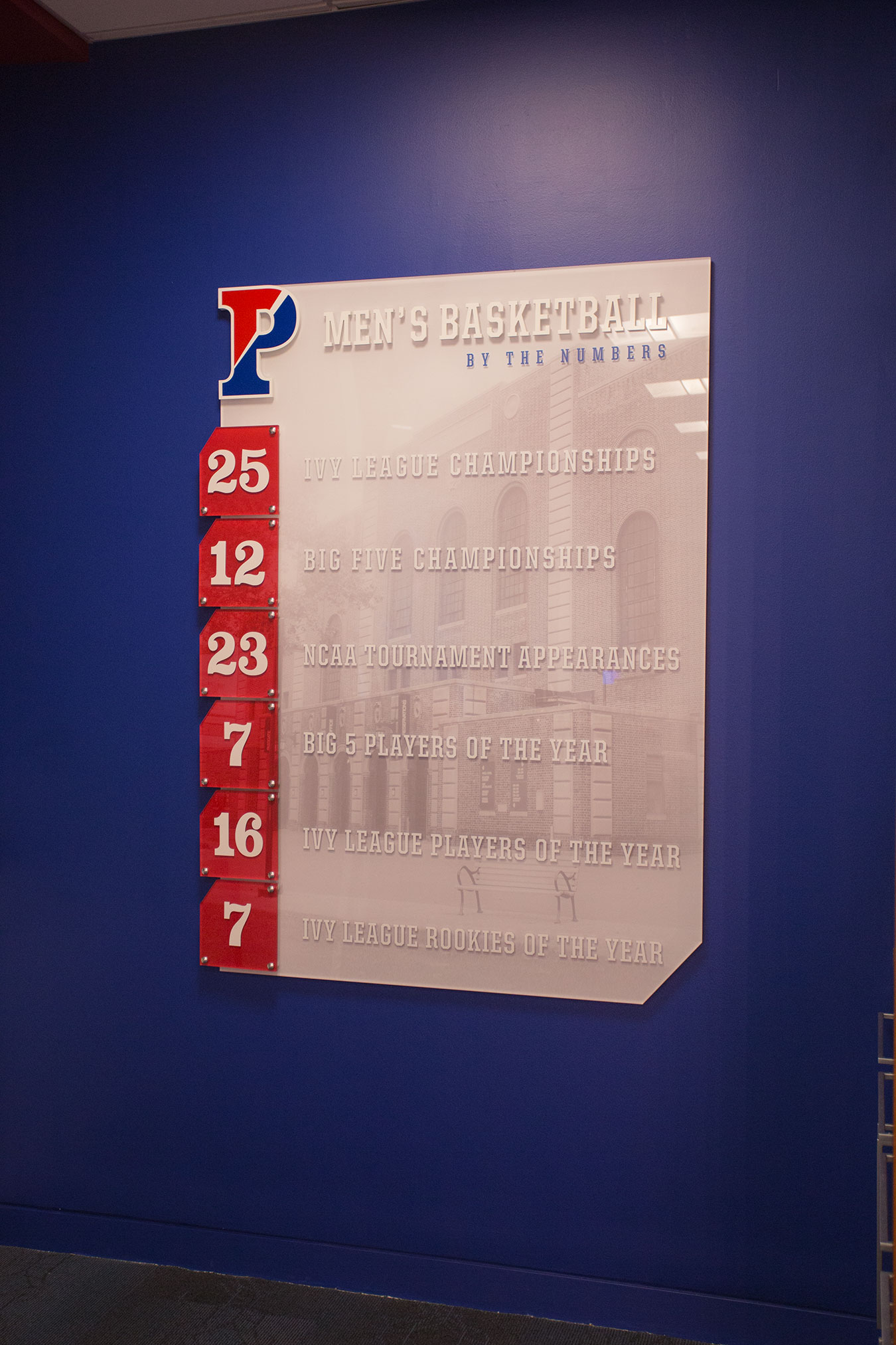
“Penn is a good basketball program and, although they don’t yet have a national title, they have a history of conference dominance, NCAA Tournament appearances and a Final Four. We took that end wall and put together a numerology display that showed that success.”
“Moving into the locker room space, we took graphics and added that color. We tied in core values that they held in high importance.” “We also carried that ‘Split P’ theme into the nameplates in the locker room. One thing we added in each locker was a panel that showed each player who previously worn the current player’s number. You can see who played before you and that you’re part of a family. That really resonated with Penn.” Advent is continuing work with Penn in the atrium of the Rockwell Gym. Advent also installed designs for men’s and women’s basketball locker rooms and offices at Marquette, Louisville and Lipscomb.